# Materializer WP
A set of Material Design components for WordPress
Materializer WP is a fully-featured set of Material Design components,
packed up in a WordPress plugin, and ready to be used on any website.
The plugin is ‘short-code based’, so you can use all of the features
easily on any post, page, or custom post type. There over 25 different
short-codes and components that take care of all the hard work, and
allow you to turn any blog or website into a Material Design wonderland.
Getting Started
===============
Installation
------------
To install the plugin:
- Download the \`.zip\` file.
- In your Wordpress Dashboard, navigate to “Plugins -> Add New”
- Select “Upload Plugin”, and choose this plugins zip file from
your computer. Hit “Install Now”.
- Once installed, simply press “Activate Plugin”, and you’re ready to
go!
Quick Start
-----------
As a quick example of what’s possible, here is how you would set up a
[Material Design Card](https://www.google.com/design/spec/components/cards.html):
``` {.commonlisp}
[card title="A Cool Card!" text="text-darken-3 grey" title_color="blue"]
I am a very simple card. I am good at containing mall bits of
information. I am convenient because I require little markup to use
effectively.
[link text="blue" to="/"]Go Home[/link]
[/card]
```
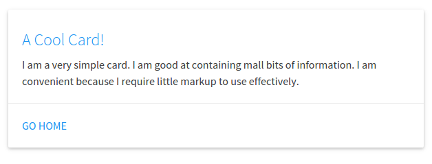
In this example, we have a `[card][/card]` shortcode, with a few
attributes. A title, the text color, and the title color. Inside of the
shortcode we have a couple more things: The card’s text, and action
links (which also have a text color attribute, and a `to` attribute
which links to the home page).
And a Material Design card is as easy as that. Cards are a great way to
have useful information and actions pop out at your visitor, while
keeping a slick design.
Features
========
Shortcodes
----------
There are over 25 different shortcodes and components to choose from.
All of the shortcodes contain “attributes” that allow several different
ways to build one component.
Below is a list of all the currently available components, click on one
to view an example, and see how to customize it.
**Cards**
- *Basic Card*
- *Image Card*
- *Revealing Card*
**Buttons**
- *Raised Button*
- *Floating Button*
- *Fixed Action Button*
- *Flat Button*
- *Large Button*
**Collapsibles**
- [Collapsible](#Collapsible)
**Collections**
- [Collection](#Collection)
- *Link Collection*
**Dropdowns**
- [Dropdown](#Dropdown)
**Images**
- *Material Box Image*
- *Responsive Image*
- *Circular Image*
**Pagination**
- [Pagination](#Pagination)
**Loading Icons**
- *Linear Loader*
- *Fixed Linear Loader*
- *Circular Loader*
- *Flashing Circular Loader*
**Tables**
- *Striped Table*
- *Hoverable Table*
- *Centered Table*
- *Bordered Table*
- *Responsive Table*
**Viedos**
- *Responsive Video*
- *HTML5 Video*
Color Pallette
--------------
There is a built in Material Design Color pallette that be used with
every short-code. You’re not stuck with the default color scheme, so you
can integrate Materializer into your existing website seamlessly.
…more info coming soon!
Shortcode Details
=================
Cards
-----
### Basic Card<<Basic Card>>
Available Attributes:
- title: The title of the card (optional)
- title~color~: The color of the title (optional)
- color: The backgrund color of the card (optional)
- text: The text color of the card (optional)
- Links: Nested Action Link short-codes (optional)
Example:
``` {.text}
[card title="A Cool Card!" text="text-darken-3 grey" title_color="blue"]
I am a very simple card. I am good at containing mall bits of
information. I am convenient because I require little markup to use
effectively.
[link text="blue" to="/"]Home[/link]
[/card]
```

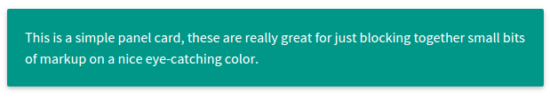
A Basic Card can also be refitted to be a more simple Card Panel:
Example:
``` {.text}
[card color="teal" text="white"]
This is a simple panel card, these are really great for just
blocking together small bits of markup on a nice eye-catching
color
[/card]
```
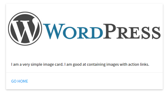
### Image Card<<Image Card>>
Available Attributes:
- img: The link to an image for display on the card
- color: The background color of the card (optional)
- text: The text color of the card (optional)
- Links: Nested Action Link short-codes (optional)
``` {.text}
[card_img img="/wordpress-logo.png"]
I am a very simple image card. I am good at containing images with
action links.
[link text="blue" to="/"]Home[/link]
[/card_img]
```
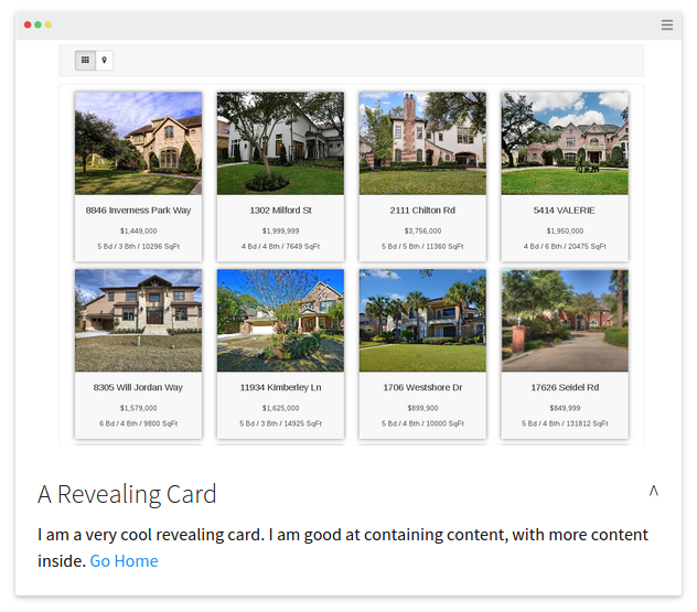
### Revelealing Card<<Revealing Card>>
A Revealing Card is like a Basic Card that can be opened to display more
information.
Available Attributes:
- title: The title of the card (optional)
- title~color~: The color of the title (optional)
- color: The backgrund color of the card (optional)
- text: The text color of the card (optional)
- img: The link to an image for display on the card
- links: Nested Action Link short-codes (optional)
Example:
``` {.text}
[card_revealtitle="A Revealing Card"]
I am a very cool revealing card. I am good at containing content, with
more content inside.
[link text="blue" to="/"]Go Home[/link]
[card_open]And here is some more content inside with some other really cool stuff.[/card_open]
[/card_reveal]
```

Buttons
-------
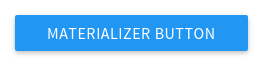
### Raised Button<<Raised Button>>
Available Attributes:
- to: The page to go to when the button is clicked
- color: The background color of the card (optional)
- text: The text color of the card (optional)
Example:
``` {.text}
[btn to="/" color="blue" text="white"]Materializer Button[/btn]
```
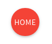
### Floating Button<<Floating Button>>
Available Attributes:
- to: The page to go to when the button is clicked
- color: The background color of the card (optional)
- text: The text color of the card (optional)
Example:
``` {.text}
[btn_floating to="/" color="red" text="white"]Home[/btn_floating]
```
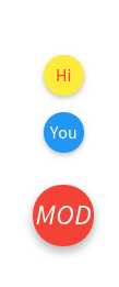
### Fixed Action Button<<Fixed Action Button>>
Available Attributes:
- color: The background color of the card (optional)
- text: The text color of the card (optional)
- action: Nested `[action]` shortcodes, that are the small popups when
the button is hovered, they take all the attributes, plus the “to”
attribute which is a link to a page.
Example:
``` {.text}
[btn_fixed_action color="red" text="white"]Home
[action to="/contact-us" color="yellow" text="red"]Hi[/action]
[action to="/" color="blue" text="white"]You[/action]
[/btn_fixed_action]
```
### Flat Button<<Flat Button>>
Available Attributes:
- to: The page to go to when the button is clicked
- color: The background color of the card (optional)
- text: The text color of the card (optional)
Example:
``` {.text}
[btn_flat to="/"]Home[/btn_floating]
```

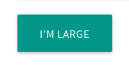
### Large Button<<Large Button>>
Available Attributes:
- to: The page to go to when the button is clicked
- color: The background color of the card (optional)
- text: The text color of the card (optional)
Example:
``` {.text}
[btn_large to="/"]Home[/btn_floating]
```
Collapsibles
------------
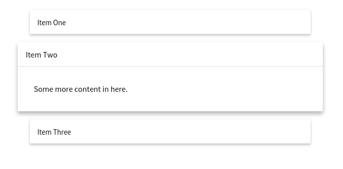
### Collapsible
Available Attributes:
- type: Either popout or nothing.
- style: Either accordion, expandable, or nothing.
- color: The backgrund color of the card (optional)
- text: The text color of the card (optional)
- collapsible~item~: Nested `[collapsible_item]` shortcodes, that make
up each item in the component. They take a title, color, and
text attribute.
Example:
``` {.text}
[collapsible]
[collapsible_item title="Item One"]Some content in here.[/collapsible_item]
[collapsible_item title="Item Two"]Some more content in here.[/collapsible_item]
[collapsible_item title="Item Three"]And some more content in this guy.[/collapsible_item]
[/collapsible]
```
Collections
-----------
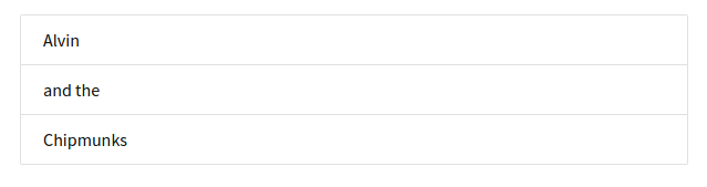
### Collection
Available Attributes:
- color: The backgrund color of the card (optional)
- text: The text color of the card (optional)
- collection~item~: Nested `[collection_item]` shortcodes, that make
up each item in the component. They take a color and text
color attribute.
Example:
``` {.text}
[collection]
[collection_item]Alvin[/collection_item]
[collection_item]and the[/collection_item]
[collection_item]Chipmunks[/collection_item]
[/collection]
```
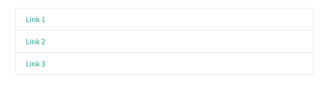
### Link Collection<<Link Collection>>
Available Attributes:
- type: Needs to be set to type=“links”
- color: The backgrund color of the card (optional)
- text: The text color of the card (optional)
- collection~item~: Nested `[collection_item]` shortcodes, that make
up each item in the component. They take a color and text color
attribute - as well as a “to” attribute which is a page link.
Example:
``` {.text}
[collection type="links"]
[collection_item]Alvin[/collection_item]
[collection_item]and the[/collection_item]
[collection_item]Chipmunks[/collection_item]
[/collection]
```
Dropdowns
---------
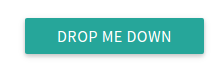
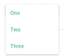
### Dropdown
Available Attributes:
- name: Give the dropdown component a name (required)
- color: The backgrund color of the card (optional)
- text: The text color of the card (optional)
- dropdown~item~: Nested `[dropdown_item]` shortcodes, that make up
each item in the component. They take a color and text color
attribute - as well as a “to” attribute which is a page to link to.
Example:
``` {.text}
[[dropdown name="mydrop" text="white"]
Drop Me Down
[dropdown_item to="/"]Home[/dropdown_item]
[dropdown_item to="/services/"]Services[/dropdown_item]
[dropdown_item to="/contact"]Contact Us[/dropdown_item]
[/dropdown]]
```
Images
------
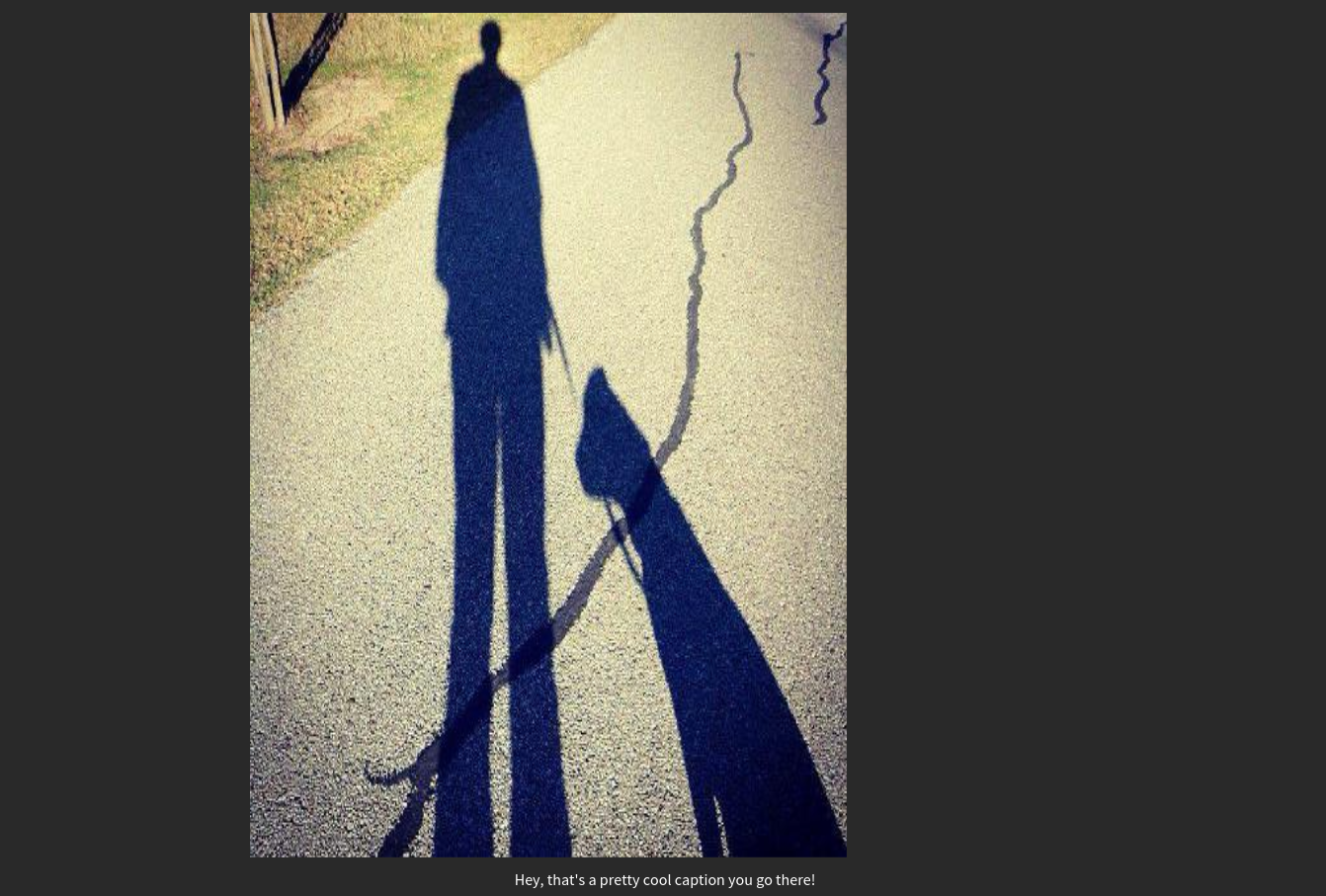
### Material Box Image<<Material Box Image>>
The Materializer Image Box displays a normal image, and when it clicked,
it open the image in a fullscreen “lightbox” style display.
Available Attributes:
- src: The link to the image
Example:
``` {.text}
[img_box src="http://mysite.com/image.jpg"]
```
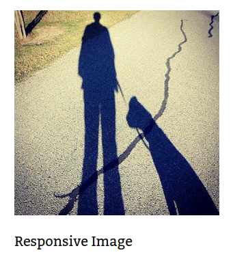
### Responsive Image<<Responsive Image>>
Automatically makes images responsive
Available Attributes:
- src: The link to the image
Example:
``` {.text}
[img_responsive src="http://mysite.com/image.jpg"]
```
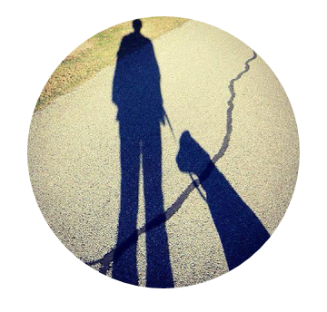
### Circular Image<<Circular Image>>
Makes any image circular
Available Attributes:
- src: The link to the image
Example:
``` {.text}
[img_circle src="http://mysite.com/image.jpg"]
```
Pagination
----------
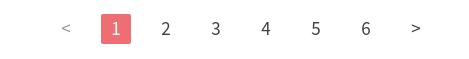
### Pagination
Available Attributes:
- color: The backgrund color of the card (optional)
- text: The text color of the card (optional)
- Links: Nested Action Link short-codes (optional)
- items: \[pag~item~\]’s are what make up the pagination. In addition
to color and text, These can take a variety of attributes:
- disabled: unclickable
- active: make this pag~item~ active
- to: a link to a page
Example:
``` {.text}
[pagination]
[pag_item disabled]<[/pag_item]
[pag_item to="#!" active]1[/pag_item]
[pag_item to="/page-2"]2[/pag_item]
[pag_item to="/page-3"]3[/pag_item]
[pag_item to="/page-4"]4[/pag_item]
[pag_item to="/page-5"]5[/pag_item]
[pag_item to="/page-6"]6[/pag_item]
[pag_item to="/pages"]>[/pag_item]
[/pagination]
```
Loading Icons
-------------
### Linear Loader<<Linear Loader>>
Available Attributes:
- color: The backgrund color of the loader (optional)
- text: The progress color of the loader (optional)
Example:
``` {.text}
[preloader_linear]
```

### Fixed Linear Loader<<Fixed Linear Loader>>
Available Attributes:
- color: The backgrund color of the loader (optional)
- text: The progress color of the loader (optional)
- width: The width of the progress bar to fill
Example:
``` {.text}
[preloader_linear width="75%"]
```

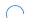
### Circular Loader<<Circular Loader>>
Available Attributes:
- color: The color of the loader (optional)
Example:
``` {.text}
[preloader_circular]
```
### Flashing Circular Loader<<Flashing Circular Loader>>
Available Attributes:
- flashing: This needs to be inside the shortcode.
Example:
``` {.text}
[preloader_circular flashing]
```

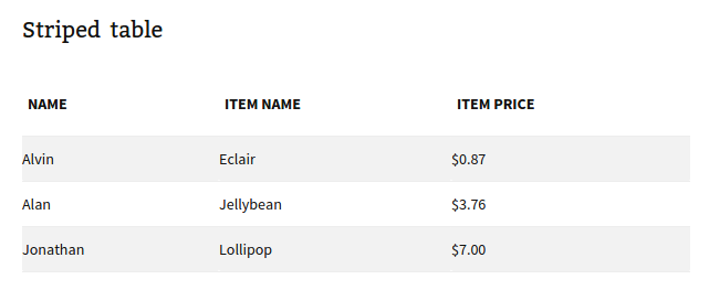
Tables
------
The table shortcodes are a bit different in that they only *wrap*
existing HTML (or shortcodes).
You can use any of the table types (striped, hoverable, centered,
responsive, bordered) together in the same shortcode.
Example:
``` {.text}
[table style="striped"]
| Item Name |
Item Price |
| Eclair |
$0.87 |
| Jellybean |
$3.76 |
| Lollipop |
$7.00 |
[/table]
```
### Striped Table<<Striped Table>>
Available Attributes:
- color: The backgrund color of the table (optional)
- text: The text color of the table (optional)
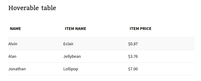
### Hoverable Table<<Hoverable Table>>
Available Attributes:
- color: The backgrund color of the table (optional)
- text: The text color of the table (optional)
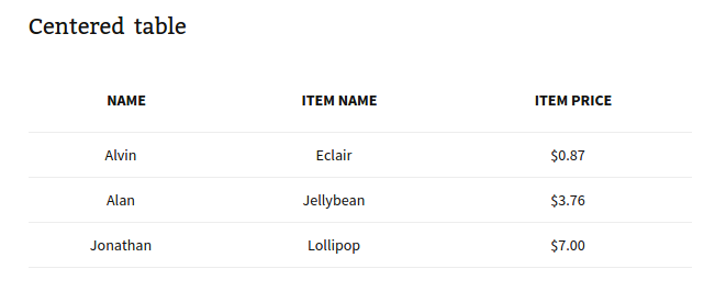
### Centered Table<<Centered Table>>
Available Attributes:
- color: The backgrund color of the table (optional)
- text: The text color of the table (optional)
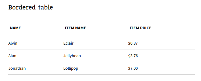
### Bordered Table<<Bordered Table>>
Available Attributes:
- color: The backgrund color of the table (optional)
- text: The text color of the table (optional)
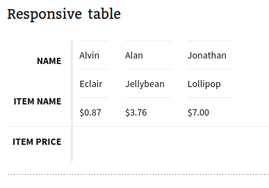
### Responsive Table<<Responsive Table>>
Available Attributes:
- color: The backgrund color of the table (optional)
- text: The text color of the table (optional)
Videos
------
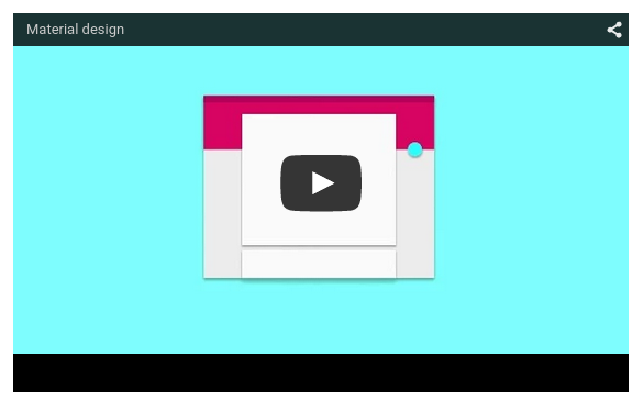
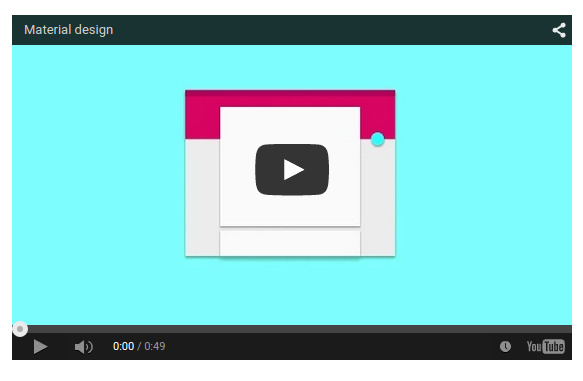
### Responsive Video<<Responsive Video>>
Available Attributes:
- src: the link to the video
- width: the width of the video in px (optional)
- height: the height of the video in px (optional)
- allowfullscreen: Allow the video to be made fullscreen (no value,
just set inside the shortcode)
- nocontrols: Remove play, pause, progress controls (no value, just
set inside the shortcode)
- frameborder: Width of the border around the video (recommended
0, optional)
Example:
``` {.text}
[video src="//www.youtube.com/embed/Q8TXgCzxEnw?rel=0" width="500px" width="100%" allowfullscreen]
```
### HTML5 Video<<HTML5 Video>>
Available Attributes:
- src: the link to the video
- width: the width of the video in px (optional)
- height: the height of the video in px (optional)
- allowfullscreen: Allow the video to be made fullscreen (no value,
just set inside the shortcode)
- nocontrols: Remove play, pause, progress controls (no value, just
set inside the shortcode)
- frameborder: Width of the border around the video (recommended
0, optional)
Example:
``` {.text}
[video src="//www.youtube.com/embed/Q8TXgCzxEnw?rel=0" width="500px" width="100%" allowfullscreen]
```