# jQuery Editable Select
[](https://npmjs.org/package/jquery-editable-select)
[](https://npmjs.org/package/jquery-editable-select)
[](LICENSE)
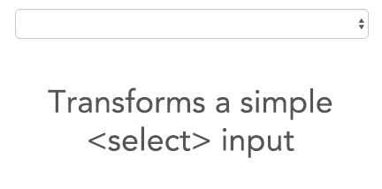
*jQuery Editable Select* is a jQuery plugin that transforms a select into an input field where single elements are shown in real-time according to the entered characters.
It scales down to a real select list when javascript is not available.
# Demo
See demos here: http://indrimuska.github.io/jquery-editable-select/
# Installation
Get jQuery Editable Select from [**npm**](https://www.npmjs.com/), [**bower**](http://bower.io/) or [**git**](https://git-scm.com/):
```
npm install jquery-editable-select
bower install jquery-editable-select
git clone https://github.com/indrimuska/jquery-editable-select.git
```
Include style and script in your page:
```html
Alfa Romeo
Audi
BMW
Citroen
```
```javascript
$('#editable-select').editableSelect();
```
## Default text
The default text showed right after the initialization.
```html
Alfa Romeo
Audi
BMW
Citroen
```
## HTML support
All HTML tags in each `` element will be rendered after initialization.
```html
Alfa Romeo - <small><a href="http://www.alfaromeo.com/">www.alfaromeo.com</a></small>
Audi - <small><a href="http://www.audi.com/">www.audi.com</a></small>
BMW - <small><a href="http://www.bmw.com/">www.bmw.com</a></small>
Citroen - <small><a href="http://www.citroen.com/">www.citroen.com</a></small>
```
### Scroll support
If the height of the list rises above 160px, a scrollbar is displayed.
You can change the max-height of the list box by overriding this css rule:
```css
.es-list { max-height: 160px !important; }
```
## Options
Options can be passed via data attributes or JavaScript. For data attributes, append the option name to `data-`, as in `data-filter="true"`.
Property | Type | Default | Description
---|:---:|:---:|---
filter | Boolean | `true` | Filter (or not) items in list while typing.
effects | Enum: `"default"`, `"slide"`, `"fade"` | `"default"` | Easing used for showing and hiding the dropdown list.
duration | Integer or Enum: `"fast"`, `"slow"` | `"fast"` | Duration of the easings (in milliseconds).
appendTo | String or jQuery element | `select.parent()` | Where to append the dropdown list in the DOM.
trigger | Enum: `"focus"`, `"manual"` | `"focus"` | How dropdown list is triggered.
```javascript
$('#editable-select').editableSelect({
effects: 'slide',
duration: 200,
appendTo: 'body'
});
```
### Default settings
You can change the default settings for a plugin by modifying the plugin's `Constructor.DEFAULTS` object:
```javascript
$.fn.editableSelect.Constructor.DEFAULTS.effects = 'slide';
// changes default for the plugin's `effects` option to `slide`
```
## Methods
### `.editableSelect(options);`
Transforms the `` into a typeahead field. Accepts an optional options `object`.
### `.editableSelect('show');`
Manually shows the dropdown list.
### `.editableSelect('hide');`
Manually hides the dropdown list.
### `.editableSelect('filter');`
Manually filters the dropdown list according to the value of the text field.
### `.editableSelect('select', $element);`
Manually sets the value of the text field to the value of the `$element` passed as parameter (it must be one of the elements in the dropdown list).
### `.editableSelect('add', text [, index [, attrs [, data ]]] );`
Adds a new option in the dropdown list. You can choose the position where to insert the element (starting from `0`) and any attributes (or data-attributes) to be assigned.
### `.editableSelect('remove', index);`
Removes an option in the dropdown list at the given index.
### `.editableSelect('clear');`
Clears all options in the dropdown list.
### `.editableSelect('destroy');`
Destroys the typeahead field and restores the `` input.
## Events
Event | Description
---|---
created.editable-select | Fired after initialization.
show.editable-select | Fired immediately when the `show` instance method has been called.
shown.editable-select | Fired when the dropdown has been made visible (will wait for CSS transitions to complete).
hide.editable-select | Fired immediately when the `hide` instance method has been called.
hidden.editable-select | Fired when the dropdown has finished being hidden (will wait for CSS transitions to complete).
select.editable-select | Fired when an option of the list has been selected. The selected `$element` is available as property of the event.
```javascript
$('#editable-select').on('shown.editable-select', function (e) {
// do something...
});
```
## Keyboard support
jQuery Editable Select includes support for keyboard navigation:
- up , down arrow keysEnter Enter button you'll select the highlighted option and replace the input field value with the option label.Enter will have a normal behavior (submitting the form, etc...)
- Tab Escape